








How to Mix Patterns in Living Room Decor: 9 Easy Rules for a Layered, Stylish Look
A living room with one pattern feels safe. A living room with several patterns, done well, feels collected, warm and full of personality. The problem is that most people stop at the safe option because mixing patterns feels like a gamble. One wrong stripe next to the wrong floral and the whole room seems noisy.
The good news is that pattern mixing follows a handful of simple rules. Once you understand scale, color, and balance, you can combine stripes, florals, checks and geometrics with confidence. This guide explains how to mix patterns in living room decor step by step, with practical combinations, placement ideas and the mistakes to avoid.
Table of Contents
- Why Mixing Patterns Works
- Rule 1: Vary the Scale
- Rule 2: Stick to a Shared Color Palette
- Rule 3: Use the Rule of Three
- Rule 4: Mix Different Pattern Types
- Rule 5: Give the Eye Room to Rest
- Rule 6: Repeat Patterns Around the Room
- Rule 7: Mind the Texture
- Rule 8: Start With One Anchor Piece
- Rule 9: Match the Mood of Your Style
- Where to Put Patterns in a Living Room
- Pattern Combinations That Always Work
- Common Mistakes to Avoid
- A Simple Step-by-Step Plan
- FAQs
Why Mixing Patterns Works
Patterns add rhythm, movement and depth. A room with only solid colors can look flat, while a room with thoughtfully layered patterns looks designed and lived in. Designers rely on pattern mixing because it hides wear, adds visual interest to simple furniture and lets you show personality without spending much on big pieces. Swapping a few pillows and a throw can change the whole mood of the room.
Rule 1: Vary the Scale
This is the most important rule. If every pattern in the room is the same size, they compete with each other. Instead, mix a large-scale, a medium-scale and a small-scale pattern. Each one then has a clear job.
- Large scale: bold motifs for big surfaces such as a rug, curtains or an accent wall.
- Medium scale: classic stripes or a geometric on an armchair or ottoman.
- Small scale: fine prints, tiny dots or micro-checks on pillows, throws and lampshades.
A quick test: stand back and squint. If the patterns blur into one busy mass, they are too similar in size.
Rule 2: Stick to a Shared Color Palette
Patterns can look completely different and still feel related if they share at least one color. Pick a palette of three to five colors and make sure every pattern pulls from it. For example, a navy stripe, a floral with navy and blush, and a geometric with blush and cream all feel connected because navy and blush repeat.
When you shop for new pieces, bring a fabric sample or a photo of your sofa and rug so you can compare undertones. Warm and cool shades of the same color can clash, so check that your whites, creams and blues lean the same way.
Rule 3: Use the Rule of Three
If you are new to mixing, three patterns is the sweet spot. Two can feel like a competition, and four or more need an experienced eye. Choose one dominant pattern, one supporting pattern and one accent pattern. You can still add solids and textures, but keep distinct patterns to three at first. As your confidence grows, add a fourth.
Rule 4: Mix Different Pattern Types
Combining pattern types creates contrast, which keeps the look interesting. Pair organic shapes with structured ones: a soft floral works beautifully with stripes, and a geometric looks fresh next to a plain check. Avoid placing two patterns of the same type side by side, such as two florals or two stripes, unless their scale is very different.
- Stripes: add structure and pair with almost anything.
- Florals: bring softness and romance.
- Geometrics: give a modern, graphic edge.
- Checks and plaids: feel classic and cozy.
- Dots: add a light, playful touch and work as a neutral.
Rule 5: Give the Eye Room to Rest
Pattern needs calm to shine. Balance bold prints with solids so the eye can pause. A useful guide is to keep roughly 60% of the room calm and solid, about 30% in your main pattern, and around 10% in accents.
Plain walls, a solid sofa, natural wood and simple curtains create that quiet backdrop. If your sofa is already patterned, keep the walls and large furniture solid.
Rule 6: Repeat Patterns Around the Room
Repetition ties everything together. If a striped pillow sits on the sofa, echo the stripe somewhere else, such as a thin-striped lampshade or a throw on the far chair. Repeating a pattern or color at least twice makes the arrangement look planned instead of random.
Rule 7: Mind the Texture
Texture counts as a form of pattern. Chunky knits, linen, velvet, jute and leather add depth, especially in rooms with softer, subtle patterns. A neutral room can feel rich just by layering a boucle pillow, a woven basket and a textured rug together. If you are nervous about bold prints, begin with texture and add pattern gradually.
Rule 8: Start With One Anchor Piece
Choose one item you love, such as a rug, an accent chair or a piece of art, and build around it. Pull your colors from that anchor and add the other patterns in descending scale. Starting with an anchor stops you from buying pieces that do not belong together.
Rule 9: Match the Mood of Your Style
Different decor styles suit different pattern mixes:
- Modern: geometrics, bold stripes and high-contrast color.
- Traditional: florals, damask, plaids and soft stripes.
- Bohemian: kilim, ikat, block prints and layered rugs.
- Farmhouse: gingham, ticking stripes and simple checks.
- Coastal: nautical stripes, light florals and woven textures.
- Scandinavian: subtle geometrics and tone-on-tone patterns.
Where to Put Patterns in a Living Room
Throw Pillows
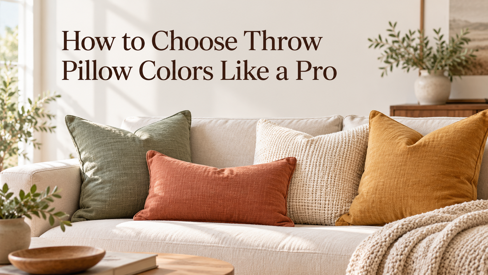
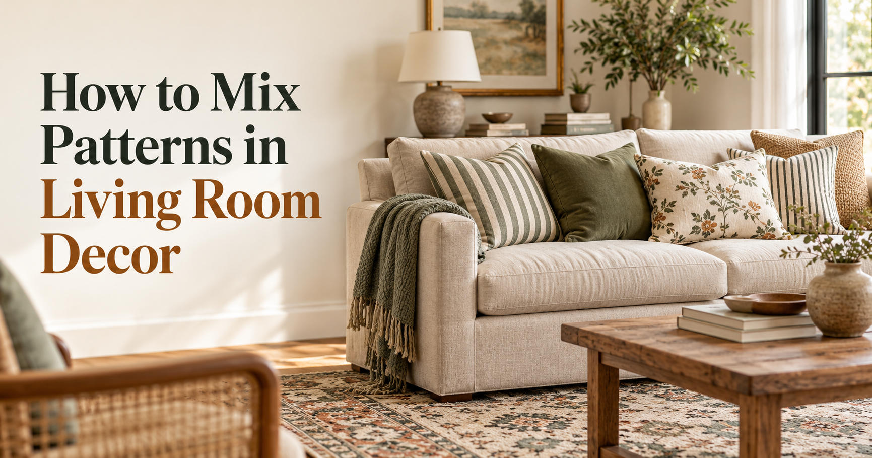
Pillows are the easiest and cheapest way to experiment. Mix three or four on a sofa, using one large, one medium and one small pattern plus a solid. Change them with the seasons for a fresh look.
Area Rugs
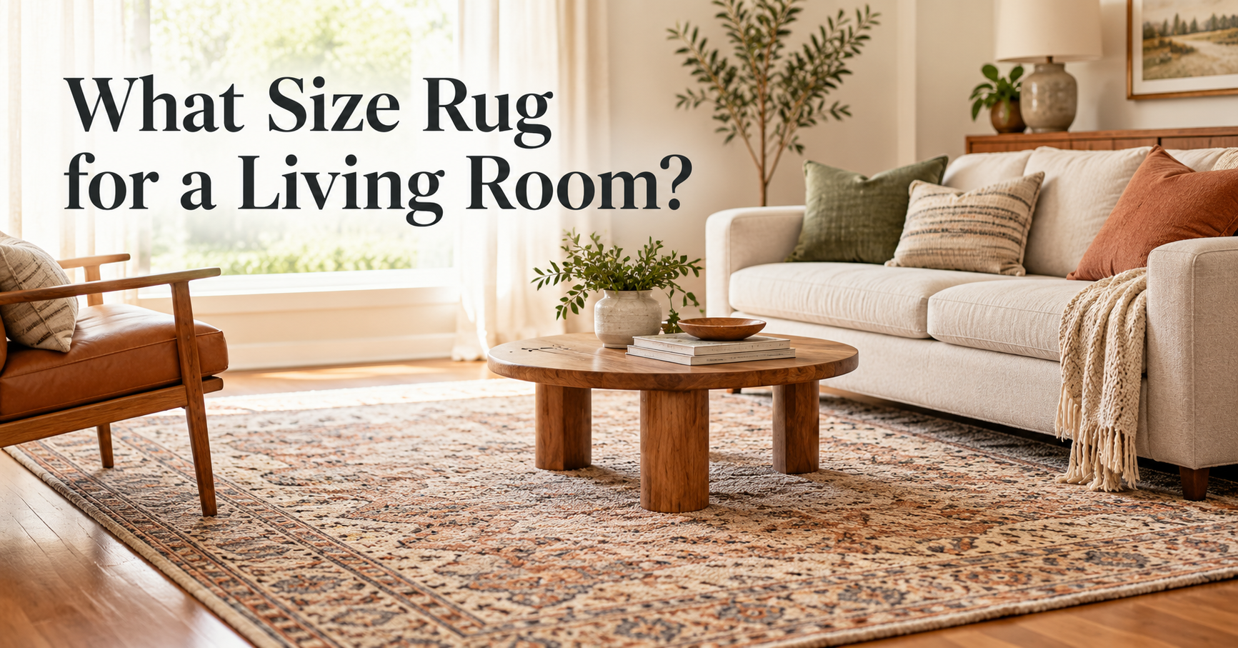
A rug is a natural anchor. A bold or vintage-style rug can lead the whole palette, while a quiet geometric rug lets other patterns stand out.
Curtains
Patterned curtains draw the eye upward and make ceilings feel taller. If your rug is busy, choose solid or very subtle curtains.
Accent Chairs
One patterned chair beside a solid sofa is a low-risk way to introduce a statement print.
Throws and Blankets
Draped over a sofa arm, a patterned throw adds layers and can bridge the colors between other items.
Wallpaper and Art
A patterned accent wall works best when the rest of the room stays simple. Gallery walls and framed prints bring in pattern without commitment.
Pattern Combinations That Always Work
- Stripes and florals: a thin navy stripe with a large soft floral in navy and blush.
- Checks and stripes: a gingham pillow with a wider ticking stripe in the same color family.
- Geometric and organic: a diamond-pattern rug with leaf-print pillows.
- Dots and plaid: small polka dots add lightness to a classic tartan.
- Animal print as a neutral: leopard or zebra works like a solid when used as a small accent next to stripes or florals.
- Tone-on-tone: several patterns in one color range for a calm yet layered effect.
Common Mistakes to Avoid
- Matching everything: sets with identical patterns look flat and dated.
- Same scale everywhere: equal-sized prints compete instead of complementing.
- No solids: without calm areas, a room feels chaotic.
- Ignoring undertones: a warm cream next to a cool white can look dirty.
- Too many colors: keep to a limited palette, even if patterns differ.
- Overlooking the room size: small rooms need smaller-scale or lighter patterns, while large rooms can handle bold motifs.
- Buying everything at once: layer gradually and adjust as you see how things look in your lighting.
A Simple Step-by-Step Plan
- Choose your color palette of three to five shades, based on your sofa, rug or art.
- Pick an anchor piece with the boldest pattern, usually the rug or an accent chair.
- Add a medium-scale pattern in a different type, such as stripes if the anchor is floral.
- Finish with a small-scale accent on pillows or a throw.
- Add solids and textures to balance the mix.
- Step back and edit. Take a photo; if something feels off, remove or swap one piece.
Budget-Friendly Shopping Tips
You do not need to replace big furniture to mix patterns. Start small and build up. Pillow covers, throws, lampshades and framed prints are affordable and easy to swap. Look for covers with a zipper so you can change inserts, and order fabric swatches or samples before committing to larger pieces such as rugs or curtains. Check how the pattern looks in both daylight and evening light, since colors can shift noticeably.
Frequently Asked Questions
How many patterns can I mix in one living room?
Beginners should stick to three distinct patterns. With experience, four or five can work if the scale, color and balance are carefully managed.
Can I mix two florals?
Yes, if they differ greatly in scale and share a color. For example, a large bold floral paired with a tiny ditsy floral.
Do patterns make a small living room look smaller?
Not necessarily. Small-scale, light-colored patterns can add depth. Avoid large dark prints on every surface, and keep walls and large furniture quiet.
What if my sofa is already patterned?
Treat it as the main pattern. Choose solid or very subtle pillows, a calm rug, and add one contrasting accent pattern at most.
What colors are safest for mixing patterns?
Neutrals such as cream, gray, navy, black, white and tan are easy to combine. Add one or two accent shades for personality.
Are stripes a good starting point?
Absolutely. Stripes work as a near-neutral and pair with florals, geometrics and checks.
Final Thoughts
Learning how to mix patterns in living room decor comes down to a few reliable habits: vary the scale, share a color palette, balance patterns with solids, and repeat elements around the room. Start with pillows and a throw, then gradually add a rug or chair as your confidence grows. A layered, personal living room is not about perfection. It is about combining pieces you love in a way that feels balanced and welcoming.